The imperative end of "helicopter money"
Jean-Baptiste Wautier | 02 octobre 2023
Jean-Baptiste Wautier, a Private Equity investor, is the author of the analysis "The imperative end of helicopter money" published by the Fondation pour l’innovation politique.
Introduction
The present note puts in perspective the monetary policy of the Western world, i.e. mainly the G7 countries and aims at demonstrating to what extent, over the last 10 years, it has been incredibly lax and exuberant, thus creating real risks of an extremely brutal economic downturn, or even a depression. Since the 2008 financial crisis, we have indeed been living in an unprecedented environment, whether it comes to the monetary policy of the Fed or, to a similar extent, that of the European Central Bank, the Bank of Japan and the Central banks of most major developed countries with governments being able to borrow at quasi-zero (0.10% to 0.20%). In other words, money had become almost free. While exceptional circumstances such as the Great Financial Crisis or the economic collapse caused by Covid could justify such a lax monetary policy for a year or two, it is already stretching it from an orthodoxy point of view. But doing it for more than a decade obviously has dramatic consequences on the behavior of economic agents and eventually on the debt levels of the economy. The brutal burst of the tech or crypto-currency bubbles as well as the recent sudden collapse of the SVB or Credit Suisse banks – the latter being a so-called systemic bank and having existed for more than a century – are all strong warning signs when it comes to the possible magnitude of the down-cycle that is yet to come.
We have gradually settled into this zero-interest rate environment and as always one managed to justify the unjustifiable, finding good reasons why this was the right monetary policy. It wasn’t the first time. In the late 90s, at the time of the dot-com bubble, theories such as “option value” started developing, concluding that cash flows and liquidity no longer mattered, thereby justifying absurd valuations and this ended in a massive internet bubble burst and a recession. Similarly, this time in support of this decade of “free money”, the “Modern Monetary Theory” asserted that there was no need for orthodoxy and no longer any issues in relation to the level of sustainable debt: since money is free, what counts in the end is prosperity and development. So we went once again very far in justifying choices that should have offended common sense. This is how we got ourselves into an unprecedented decade of monetary stimulation, bordering on the irrational. Taking a step back, all these theories defending the soundness of zero interest rates for long have actually fuelled massive excesses with worrying, even frightening consequences.
Of course, zero interest rates can be temporary measures. But in recent years we have been responding to various crises by printing money. We cannot have an economic system where risk-taking is not rewarded. It makes no economic sense. It is therefore urgent to adjust our focus and not to let people believe that the situation will be solved by a few incremental and modest measures. We must be aware that if inflation sticks, interest rates will have to rise sharply and stay elevated, which will lead to households, companies and the economy as a whole becoming pressured. Government budgets will have to be cut, as the debt burden will become unsustainable. The same will happen to local authorities and businesses. Every economic agent will eventually become poorer.
I. AN UNPRECEDENTED LEVEL OF OVER-INDEBTEDNESS
Untamed monetary policy
The present situation of over-indebtedness is the result of an untamed monetary policy over the last decade. In order to understand how this situation came about, it is necessary to look at some macroeconomic indicators over the long period. The first good indicator is the base rate set by the central banks in the various countries, with the United States as the main reference, since it has the world’s reference currency, accounts for a quarter of global GDP and has consistent data over long periods that are relatively homogeneous.
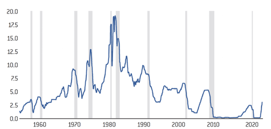
Effective federal funds interest rates (in %)
Source :
FRED
The graph above is from the US Federal Reserve (Fed) and plots the base rate: going back to the post-World War II period, there is a period of rising rates between the 1970s and the 1980s, peaking at 20%, which was the result of the fight against inflation that we had to wage in those years, largely as a result of the two energy shocks. We can also see that since 2000, and even more so since 2010, rates have fallen to zero or have become almost negative. They are indeed “negative” because this graph shows the nominal benchmark rates in the US, which would have to be adjusted for inflation to obtain the real rates for each of these years. And since 2010, inflation has not been at zero. These zero or even negative rates have therefore been in place for a very long period, since 2010 to be precise. This all started during the subprime crisis in 2008, which caused the biggest financial crisis of the post-war period, but they have then continued to be prevalent for almost 13 years.
This situation is unprecedented in history, as illustrated by the graph above. If we were to try to show real rates over this same period, we would see that they have always remained positive, including in the late 1970s, since when the Fed raised rates to 20%, inflation was between 12 and 15%. We were therefore in positive real rates, even during these periods of inflationary crisis.
The catastrophic effect of Quantitative Easing (QE)
Considering that exceptional circumstances justify exceptional measures, the Lehman Brothers bankruptcy led to the invention of the famous Quantitative Easing (QE) in the United States – a programme of debt repurchases by the central banks themselves – initially in the form of the Troubled Asset Relief Program (TARP).
This was the American response to the subprime crisis: to save the banking system, the central bank itself had to buy up debt in order to ensure the liquidity of last resort and thus the sustainability of a banking system in which confidence had disappeared. Everyone, Americans and Europeans alike, followed suit in order to save the system. At the time, there was a fear of generalized bank failures and thus of a collapse of the economy. This risk could justify these exceptional measures, but they were supposed to be only temporary. Their use was to be limited to the crisis period. However, we have continued to use Quantitative Easing until today. We have made constant use of it, and even accelerated it during the Covid crisis. Not only did we maintain zero or even negative interest rates over a long period of time, which encouraged the expansion of debt, but the Central Banks also began, through their Quantitative Easing policy, to buy various financial instruments and hold them, further amplifying monetary creation.
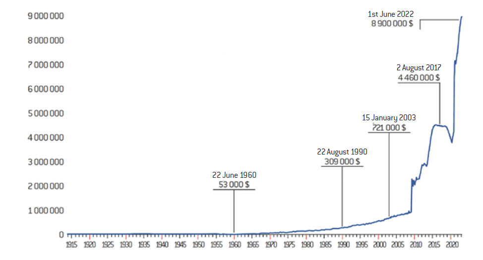
To assess the exceptional nature of this money creation, one can examine the data yet again prepared by the Fed itself (graph 2).
Federal Reserve Balance Sheet, 1914-2020 (in millions of dollars)
Source :
Center for Financial Stability
This graph illustrated that from World War I until 2010 the Fed’s balance sheet grew from about $0 to $1 trillion. Until 2009, the trend is relatively moderate: it essentially corresponds to the necessary lags between money creation and destruction, as well as to the growth of the US GDP. In 2009, when Quantitative Easing was invented in order to deal with the financial crisis, the US Central Bank’s balance sheet grew from 1 trillion to 5 trillion USD (between 2009 and 2018), a progression never seen in history. The graph then also shows what happened in 2020 to 2021, namely an even larger increase from 4 trillion to 9 trillion USD in about a year. In summary, the Fed went from a balance sheet of 4 trillion to 9 trillion USD in less than a year, while its balance sheet had previously progressed from 0 to 4 trillion USD in almost a hundred years (from 1914 to 2020). This is excessive in itself, but it is even worse since this took place in an already very lax monetary environment, with almost zero interest rates for the past ten years as demonstrated above.
Quantitative Tightening
Central banks have long known the probable consequences of their policy as well as the fact these are neither reasonable nor sustainable. Quantitative Tightening has therefore been initiated, with central banks trying to forcefully shrink their balance sheets while they increase base rates. This means that they are massively reducing overall liquidity largely ignoring what this will produce. In the same way that we don’t know exactly what Quantitative Easing eventually resulted in, even though it is reasonable to think that a zero-interest rate policy has inflationary consequences – this is the basis of monetary theory. Quantitative Tightening has so far been underway for 6 months and has only reduced the Fed’s balance sheet by half a trillion, or 500 billion USD. Yet we are already sensing great tension in the markets. Accelerating the reduction of the balance sheet cannot be beneficial. What is certain is that we no longer have the massive liquidity boost that we have enjoyed over the last ten years, and even more so over the last two years.
In short, we have had an unprecedented monetary stimulus, bordering on the irrational when you analyse the trends and graphs above. We have coped with the various crises over the last few years by printing money. Whether it was for the financial crisis or for the economic crisis during the pandemic. This last economic crisis was indeed created by governments, since it was not the virus itself but rather the lockdowns decided by the various countries that caused the downturn during the same period. But we are now reaching the end of the helicopter money era.
A policy of simultaneous excess in all developed countries
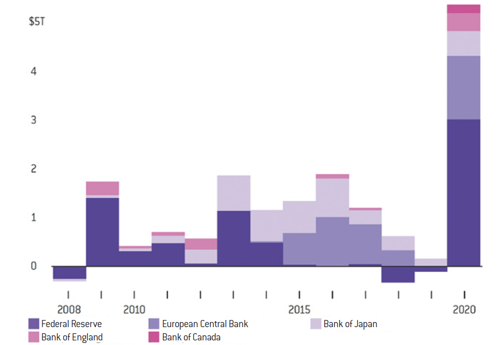
The aggravating factor is that all developed economies acted in the same way and at the same time. This is quite rare in history as global economic crises are rare since usually only one region of the world gets hit hard at a time. However, in this particular case, the central banks of countries representing about 50% of the world’s GDP adopted the same policy at the same time: the Fed, the European Central Bank, the Bank of Japan, the Bank of England, Switzerland, Canada, etc. This synchronicity of excesses has dramatically increased the level of risk. We no longer have counter-cyclical effects, where some economies do better while others do worse, and which allows us to not have such pronounced down-cycles.
The graph below was compiled by Bloomberg (public data). It can be observed that the US, Europe, Japan, Canada and the UK all did the same thing at the same time by adopting this now famous exuberant monetary and fiscal in response to the financial crisis or the Covid pandemic.
The surge in purchases – Central banks have stepped up their asset purchases to support governments’ response to the pandemic
Source :
Data compiled by Bloomberg
Note: Figures represent values converted to USD from local currencies
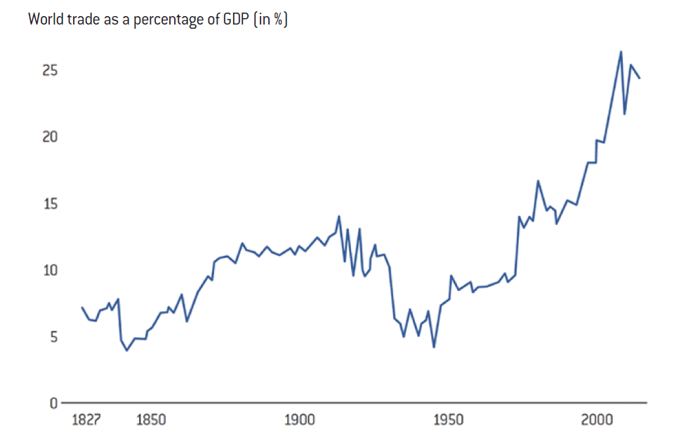
Worth noting when it comes to this synchronicity, or the fact that everyone made the same mistakes at the same time, there is often talk of the world nevertheless becoming less global with interdependence receding, etc. However, when we look at a graph produced by a team from the Centre for Prospective Studies and International Information (CEPII), it appears that the amount of trade as a proportion of world GDP does not show a trend towards deglobalisation at all ! At most, we will go from 25% to 24% of world GDP and the trend remains one of interdependence. If deglobalisation ever takes place, it will take decades, as it would require the relocation of many assets and manufacturing sites. This hypothesis seems very unlikely. In reality, we have never been so interdependent or so global (see graph 4). It is therefore even more unlikely that a crisis in the United States would not contaminate Europe, and vice versa.
Globalisation is at an all-time high, and has not shown any sign of reversion
Source :
Michel Fouquin and Jules Hugot, Centre d’études prospectives et d’informations internationales, 2016 ; data from « Our world in data »
Debt as a percentage of GDP is the main relevant indicator when it comes to the consequences of this lax monetary policy
Once all this has been established and on rather a factual basis, there remains the question of the effects of this monetary policy and how it can be measured objectively.
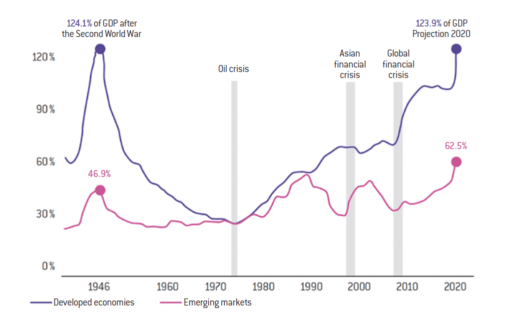
There is natural tendency to try and justify all these monetary policy decisions and to claim that they were under control, that these decisions were necessary at times of crisis, but that outside the exceptional, monetary policy was overall measured and reasonable. There is one indicator that is difficult to dispute: debt as a percentage of GDP. This long-term macroeconomic indicator is the most relevant when measuring whether fiscal and monetary policies are excessive. It is typically measured based on homogeneous public sources collated over long periods and the graph below uses IMF data whose reliance and relevance shall not be debated.
The Great Debt Spike – GFC and Pandemic led to historic levels of Debt/GDP
Source :
International Monetary Fund Fiscal Monitor, October 2020
Note: Advanced economies and emerging markets are a sample of 25 and 27 countries respectively.
Eoghan Dalton, « Lagarde says inflation crisis came from ‘nowhere’, describes Putin as ‘a terrifying man », The Journal, 27 mars 2023.
This graph shows a post-World War II peak at 124% of GDP, which is understandable after the world’s largest conflict in history. It distinguishes between advanced economies and emerging markets, with ‘advanced’ being defined the same as today i.e. the Western world as well as Japan and China. In other words, the most powerful economies. We can see that following the Second World War, both as a result of GDP growth and budget surpluses, the debt ratio decreased steeply until the 1970s. The following years become complex, marked by hyperinflation and recession: budget deficits increase in an attempt to revive the economy. However, developed economies managed to remain in the 50-60% range from the early 50’s until roughly the early 2000’s. Overall, the debt ratio rises from 30% to 60%, and rather significantly from the 1970s until the collapse of Lehman Brothers in 2008. This graph perfectly illustrates the monetary exuberance of the last twelve years with the ratio going from 65-70% to its all time high of 124% post WW2. This corresponds to the period of accommodative monetary policy described above. We have reached a level of indebtedness as high as the one found in the aftermath of the biggest war in human history.
Cheap money is always the source of speculative bubbles
It is therefore difficult to dispute the link between exuberant monetary policy and overall level of debt. We have reached a level that we simply must come down from, especially at a time of fast rising interest rates. This level has not only increased considerably, but also at a rapid pace. Crucially, this will have created speculative bubbles in many areas, including the tech space, real estate and large parts of the financial markets amongst others. For example, this has allowed European households to witness real-estate borrowing rates of less than 1% over 25 or 30 years, while inflation was at 1.5 or 2%. However, whenever a household or any other economic agent can obtain a certain amount of leverage thanks to artificially low rates, it will often take on debt that is unsustainable in the long run when rates return to normal. If a household has a €2,000 monthly budget to repay a property loan, it will not have the same financial means whether it takes out a loan at 4% or 1%. Many people have made purchases with an unsustainable level of debt capacity, thereby leading to rising property prices. Bubbles were created: money became artificially or excessively available allowing buyers to borrow more than they should have, thus paying even larger sums for the houses they wanted.
There is a similar system in financial markets, as some transactions usually benefit directly or indirectly from some form of leverage. Tech stocks are also a perfect example and we have clearly began to see this particular bubble deflate. In this sector, many companies are not profitable, so they are constantly needing to raise capital. But again, these companies have managed to raise capital, which has become almost free, in amounts that they would not have been able to raise under normal circumstances. The return on risk was inappropriate. Placing excess money into the system inevitably creates many bubbles, resulting in asset inflation and thus contributing to overall inflation.
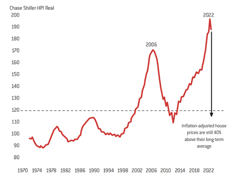
Another example is the US housing market, a particularly important one since real estate overall is the world’s biggest asset class, larger than stocks and bonds. In the US alone, it represents between 2 and 3 times the total US GDP and in the last three to four years (between 2019 and 2022), US real estate alone has increased by 45%. This data was made public recently in the New York Times and has been compiled for a long time by Schiller and his team, a reliable American economist who has become a reference in this space.
A fatally inflationary monetary policy
This excessively accommodating monetary policy has led to disproportionate money creation, whether for households, companies or governments. It has encouraged multiple and often uneconomical or unsustainable purchases. In addition to creating speculative bubbles and leading to over-indebtedness, in an economy growing at an average rate of 2 or 3%, this monetary policy has had a clear inflationary effect.
Evidently, other factors contributed to the current spike in inflation: lockdowns, supply-chain issues, the war in Ukraine with the resulting increase in the price of raw materials, etc. Although some could object the sanctions decided against Russia, the largest exporter of raw materials (roughly a third of global annual raw materials production), one cannot pretend to discover the potential economic consequences. Irrespective of this, such an exuberant monetary policy can only have fueled inflationary trends. Christine Lagarde, in an interview in October 2022, indeed expressed her surprise: “inflation has come out of nowhere”.1 This astonishment itself is rather surprising, but the purpose of this note is not to decide whether inflation was mainly due to external shocks or exuberant monetary policy. The fact is inflation is now well installed globally and imposes new constraints when it comes to monetary and therefore fiscal policy.
The lesson of the 1970s
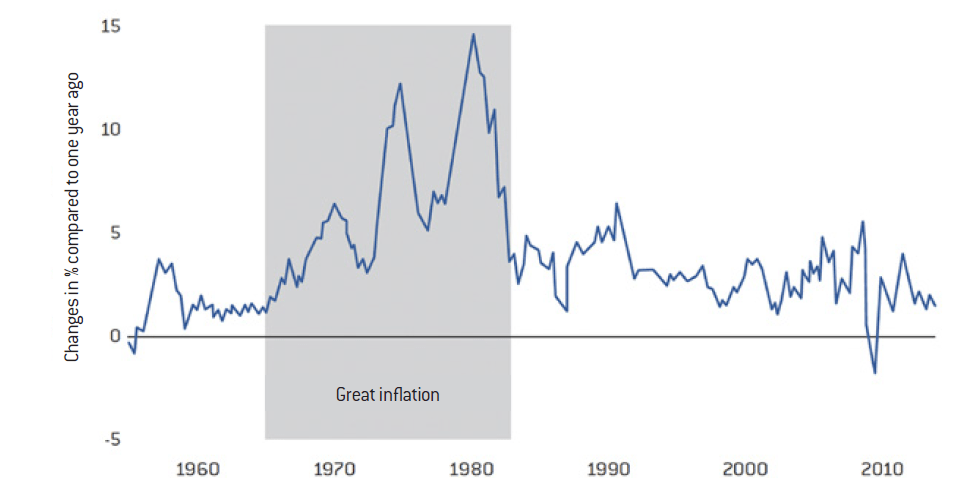
The question now is how much inflation will grow and for how long. To understand what is happening today, it is useful to look back at the 1970s. Due to a generational effect, most of us have never experienced this kind of inflationary environment. Contrary to what we often read, the inflation of the 1970s bears a striking resemblance to the period we seem to have entered, as the following graph illustrates.
Inflation measured by the consumer price index
Source :
FRED
This graph from the US Central Bank shows the period of Great Inflation, in grey, which began in the late 1960s and early 1970s and was accelerated by the oil shocks. Interestingly, when we entered this inflationary period, we did not enter it directly at 10% or 15%, but at 5%. Then it went down to 4% before increasing back to 5% or 6%, peaking briefly at 12% and falling back down to 5%. It finally peaked at 15% in 1979, at the time of the second oil shock.
This shows that:
a) Inflation levels today are the same as they were back in the 70’s, contrary to what one might think. We have the impression that it was hyperinflation then, but it was not. We went from 5%, 6%, 7% to 10%, 15%, fluctuating this way for about ten years, before managing to finally keep inflation under control.
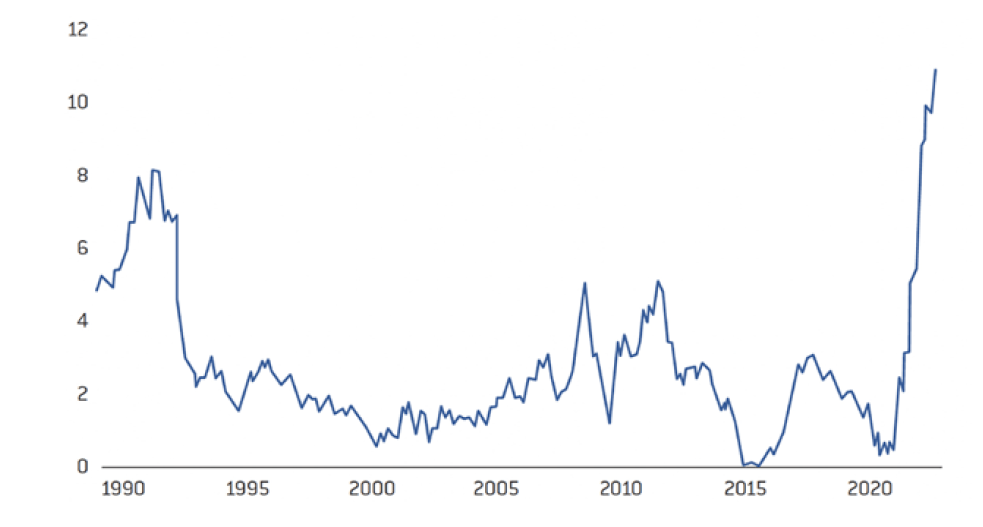
b) The evolution of inflation is neither linear nor fast-moving, and history seems to repeat itself today. We can see that this inflationary environment has lasted for about fifteen years, and that it has not developed in a linear way but rather an irregular way. These two observations are important. The inflation we are currently experiencing is between 5% and 10%. A peak of 15% does not seem impossible. In the United Kingdom, we were already at around 12% and in the euro zone, around 10%. This shows the unstable aspects of this dynamic which should warn us against the claim that 7.2% inflation, for example, is a good surprise compared to the estimate of 7.3%. On the one hand, this difference is smaller than the margin of error and on the other hand, history has shown us that inflation tends to oscillate.
c) The last lesson that can be drawn from this graph about this period is that inflation only collapsed in the early 1980s.
If we look at Graph 1, which shows the Fed’s key base rate over this period, we can see that following the change of the Fed Chair, inflation fell. Indeed, Paul Volker did what any central banker should have done when he saw inflation at 15%: he decided to implement a sharp increase in base rates to 20%. His decision was implacably logical: to stop inflation, real interest rates had to be raised and largely positive. So, if inflation is at 15%, setting base rates at 20% will result in real rates of 5%. This worked, although it brought the economy to its knees. Separately, and still not meaning to add to the theoretical debate about inflation, if monetary policy is the main tool to combat inflation, it becomes difficult to argue that it would not have had any impact in the opposite direction.
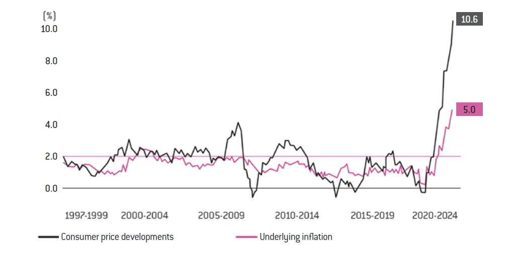
Inflation reached 10.6% in the eurozone
Source :
Eurostat
United Kingdom: Consumer price index, 12-month change (%)
Source :
Office for National Statistics
II. INFLATION TODAY
The measurement of inflation and lag effects
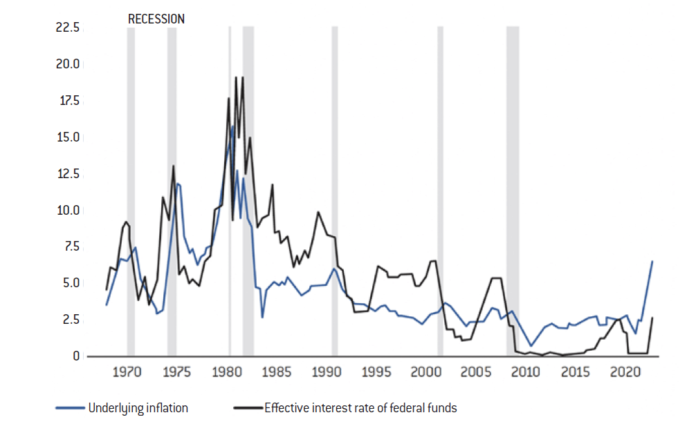
Nowadays, inflation is around 10%, but there is always a lag effect between inflation and interest rates (which is probably happening). The following graph shows this lag effect between the inflation curve in blue and the Fed’s key interest rate curve in black, starting in the 1970s. There is a clear sharp rise in rates to 20% and inflation to 15%.
Blame the lag: every Fed chairman since the 1970s has raised rates right up to the time of the recession, then lowered them considerably – The Fed’s response to inflation (in %)
Source :
Federal Reserve Board, Federal Reserve Bank of Atlanta
We can see that inflation is coming down, but we can also see that central banks are always late. They anticipate a certain level of inflation and unemployment, but these expectations turn out to be too optimistic and they therefore react with delay. We are still chasing inflation. It suffers from multiple biases. Firstly, it is badly measured: for example, in France, the share of housing in the INSEE index does not correspond to the real housing expenditure of households. Thus, when housing expenditure explodes, as it is doing today and will continue to do, this tends to underestimate the measure of inflation. The other bias that we observe is averages. Inflation does not affect different social classes in the same way. Finally, there is a time lag of several months between the moment when economic agents increase their prices and wages and the moment when these increases are reflected in measured inflation.
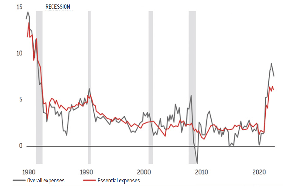
US consumption index, change from previous year (%)
Source :
Labor Department
Note: The “essential expenditure” curve excludes food and energy prices.
In the United States, inflation is defined differently, depending on whether food and energy prices are included or not. These differences in definitions could be problematic, since in reality, energy and food are part of everyone’s primary expenditure. Some justify these exclusions by arguing that price increases in these sectors are temporary. Unfortunately, this is not always the case. This is therefore not a satisfactory way of looking at things. This curve, whether or not it includes the definition of “overall” or “core” expenditure, shows that inflation is skyrocketing anyway, as it did in the 1970s.
In France, we say that everything is fine, that our inflation is only 5-6% and we keep offering vouchers for various forms of consumption. France is not isolated from the rest of the world and will not find itself in a situation where it is the only country to have controlled and manageable inflation while the rest of the world is experiencing double-digit inflation.
These are just time lags, latency effects linked to what has been achieved in the energy sector, which is not sustainable. It is also linked to the way Insee measures inflation.
However, the euro zone, which is made up of many countries, shows the same trend: inflation at 10%. And even if you exclude energy and food, despite this being meaningless, the trend is the same. People want to say “inflationhas stabilised, we are still at 6% in France, stabilised at 10 or 12% in the UK, etc.”. It is also claimed that the rise in interest rates, the economic slowdown and the energy crisis are on the way out and that everything will soon be back to normal.
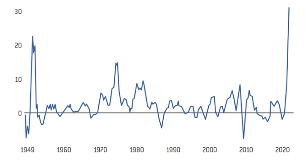
As inflation in the 1970s shows, it is not linear. It does not go up and down uniformly. It remains elusive and pervasive; it permeates the economy and unfortunately does not go away easily. It would be easy to retort that the worst is never certain and that we should manage to achieve a soft-landing of the economy. However, at the level of the economic agents themselves, inflation is by no means disappearing. It is continuing, or even accelerating in certain sectors. This can be observed, first of all, through producer prices: they represent a measure of inflation for manufacturing companies. The case of Germany offers a good example thanks to its public data. But the trend is more or less the same everywhere. Here, prices have soared, not by 10% or 12%, but by 30%. This does not necessarily mean that inflation on consumer goods will also be 30%, but it does tell you the extent of the impact of inflation on the cost structure of the company.
German producer prices are rising at a record pace – Annual % change in industrial product prices
Source :
Destatis, Refinitiv
See ”Grande distribution: Michel-Edouard Leclerc annonce une « inflation à deux chiffres”, Capital, November 8th 2022, and Pourvu que ça dure, ”Une inflation alimentaire de plus en plus insupportable”, Public Sénat, October 28th 2022.
Daniel Ducrocq, « Quelles perspectives d’inflation pour la grande consommation en 2023 », NielsenIQ, Novembre 7th 2022.
This graph shows a yearly evolution with a peak of 30%, and one could believe it has stabilised. But if this is the case, it means that this 30% inflation will remain at about this level. If we were at 100 points before and we are at 130 points now, and if inflation has stabilised, then it will remain at 130, and therefore will not go back down to 100. That’s why this increase in business costs should translate, if it is stable, to higher prices for consumer goods. Businesses will have to pass on the increases they experience in the products they sell. Indeed, it is not as if their production prices went up and then came down just as quickly.
Moreover, the latency effect we mentioned continues to play a role here. Between the moment when the price increase is decided and the moment when these prices are paid by the consumer, some time may pass. Finally, there is what can be called the “full year effect”: when producer prices explode over 3 months, from 100 to 130 points, between September and December, companies do not need to pass on these price increases over the whole year, as they will only have affected their results over 3 months. They have passed on a small part of it over 2022, and will be able to spread it out over the whole of 2023. This is why inflation has this relatively elusive characteristic.
The warning given by the large retailers
Today, all the major retailers blow the whistle2, anticipating the consequences for consumers. For example, in France, we currently have annual negotiations between the major retailers, Carrefour, Leclerc, etc., and the large groups such as Danone, Nestlé, etc. When suppliers say they want to achieve +20% on a product, a negotiation takes place. If they agree on an increase of 12% for example, these rates will not be applied until two or three months later, and it will be measured again after two or three months in the best case. To discern a real trend, it is preferable to have data for at least 6 months, in particular to rule out measurement anomalies. As a general rule, it takes between six months and a year from the time when economic agents behave in an inflationary manner to the time when this effect is measured. However, it is only from this measurement that governments and central banks can act, as they can only decide on economic and monetary policy changes on the basis of observed data and clearly established trends. This is a crucial point to bear in mind.
To return to an undeniable point, the current inflationary trend remains established to this day. Even the most cautious, such as Nielsen, predict that food will remain inflationary at least in the first half of 20233.
They are describing an economic reality: a lot of time passes between the moment of a sudden increase in the price of energy, raw materials, as well as the cost of labour in certain categories, and the moment this increase is reflected in the inflation index.
We are therefore living under the illusion that this will disappear as quickly as it came. Unfortunately, there is little hope of this happening. Once inflation has spread through the system, it takes a long time to subside. Therefore, we feel that we are making the same mistakes as in the 1970s: we are forgetting the lag effects, the full-year effects, the non-linear nature of inflation. So, we let inflation settle, we imagine that it will end when it does not. And indeed, the reality is that no economic actor sees a slowdown in the very short term. Bakers and other energy-intensive businesses are facing bankruptcy risks, if they have not already succumbed. English nurses have gone on their first strike in a hundred years. Despite this, the same mistakes are being made. We imagine that it will go well, but it hasn’t yet.
The effects of the wage-price loop
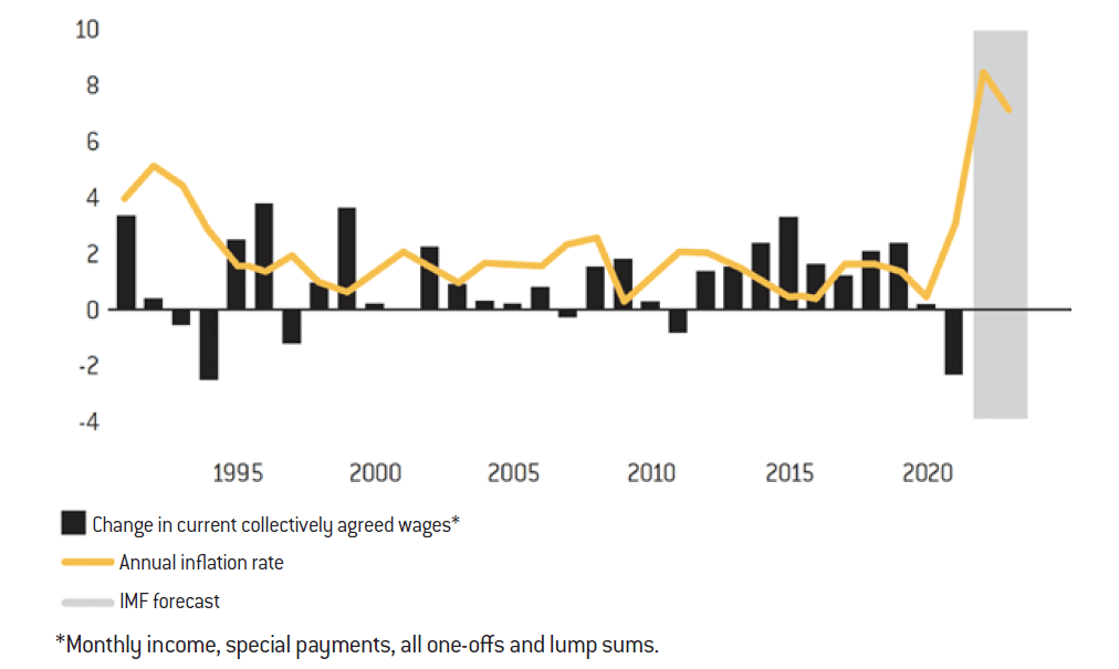
If inflation remains high, which is likely, and we go into negotiated labour agreements, for example with a sliding wage scale, there is a very high risk that companies and governments will be forced to increase wages, especially in our western democracies. We are starting to see this everywhere. In the UK first, but also in the US and Germany. In the following graph, produced by the German trade union IG Metall, one can observe the wage curve over a long period in Germany, in the metal and electrical sectors.
Wage agreements for the German metal and electrical industries (in %)
Source :
IG Metall, World Bank, IMF
This puts in perspective the scale of a recent wage collective agreement. The increase includes bonuses and is spread over two years and benefits 4 million people in Germany. It is equivalent to a salary increase of about 10% per year, if you include the yearly 5% base salary increase and the 3,000 euro bonus that is ‘guaranteed’. The companies managed to limit these agreements to 2 years by saying that new negotiations would take place if inflation continued. The German social partners are known to be relatively “responsible” in their negotiations. However, 10% is approximately the inflation rate in the Eurozone, as we have shown. This is done in a large sector, representing 4 million employees. It is therefore clear that inflation has a strong effect. The companies that are going to have to pay 10% more for salaries in 2023 and 2024 will not be able to absorb everything in their margins. They will therefore pass on their costs to the products they sell. In this respect, the European Central Bank has expressed concern about the German agreement in the metal industry which could lead to a wage-price loop effect that prevents the control of inflation.
All this supports the idea that we are experiencing a similar event to that of the 1970s: once inflation has started to arise, it does not go away quickly, even if it can be contained with sound monetary policy.
In the UK, for the same reasons, Rishi Sunak, the new Prime Minister, has urged businesses to moderate wage increases4. When the costs of services or production rise, companies’ costs rise, and they pass these increases on to the prices of the goods they sell. As a result, inflation remains high and purchasing power is lost again, wage increases are demanded again, and so on, resulting in a never-ending cycle. The nurses’ strike in the UK is a good example of this cycle, with a demand for a 20% pay rise5. More and more professions are seriously considering it.
Central banks’ expectations: always a step behind
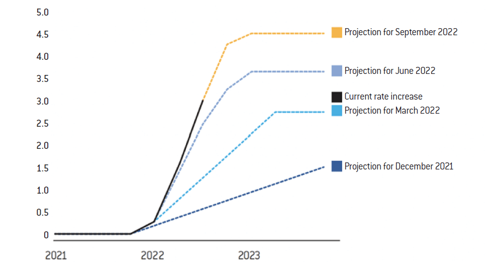
As for the Central Banks, they may be in denial about inflation, as they were in the 1970s, or they may be lagging behind. The following graph shows the Central Bank’s rate expectations.
Fed rate hike expectations (in %) – Fed officials have raised their estimates of their rate hike policy
Source :
Federal Reserve
Note: Policy rate projections reflect the Fed’s positioning on averages.
Howard Schneider, « Fed’s Bullard: Even ‘dovish’ policy assumptions require more rate hikes », Reuters, November 17 th 2022.
This chart shows the Fed’s expected rates between September 2021 and September 2022 for the year 2023. For example, in December 2021, the Fed expected policy rates for 2023 to be 1.5%. In March 2022, the Fed expected policy rates in 2023 to be 3%. In three months, these expectations were doubled. In June 2022, three months later, it went from 3% to 3.75%, almost 4%. Then, in September 2022: 4.5%. Today, according to the Central Bank’s communication, we should be above 5% 6. Some central bankers are even increasingly talking about a rate above 6%.
So, over one year, and regularly every three months, we have gone from an expectation of 1.5% to 5%. We can think that changing one’s perspective from 1.5% to 5% in 9 to 12 months shows that the phenomenon is poorly understood and badly anticipated, that the banks do not have a good measure of the inflation phenomenon, or that the communications are very political and are intended not to scare. In any case, their ability to “land” the economy gently seems limited, a situation is similar to that of the 1970s. This is unfortunately very consistent with the lag effects typical of inflation, and unfortunately, we haven’t learned much from past mistakes.
The risk of a sudden rise in key rates
The main tools for controlling inflation are monetary tools. There is no debate on this point, all central bankers know it: the only way to fight inflation is by changing key rates. From a purely factual perspective, we must admit that interest rates are the first tool in the fight against inflation. If interest rates work in one direction, they also work in the other. Friedman believed that inflation was only caused by monetary policy. Friedman is now reviled because he is thought to have fueled Reaganomics and Thatcherite liberalism. This is partly true, but it does not mean that his monetary theory was wrong, it has never been proven one way or the other. But from a common sense point of view, we can see that it must contribute to it.
Even if rates are brought up to a high level, for example to 5%, if inflation is at 8% or 10%, real rates remain negative, at -3%, -4%, just like in the 1970s until the arrival of Volker, who brought rates up to 20%. Rates were raised, but not quickly enough to curb inflation. To act effectively today, and not have to chase inflation any longer, it would have to fall very quickly, to well below 5%, which seems unlikely given what has been discussed previously. Today, we are still in negative rates which will prevail for the coming 3 to 6 months at this rate. It is likely that this curve will continue to rise until key rates are raised above the rate of inflation, by 3 or 4 points, in hopes to counteract it. So, in theory, rates closer to 10%…
We are only at the beginning of the monetary restrictions. The economy has too many levers meaning we will have to lower the general level of debt. This implies some fiscal austerity from the state, but also austerity from households. The companies themselves cannot invest as much as before. The tragedy is that consumers are already suffering, and their purchasing power is deteriorating very quickly, even though we are only at the beginning of this great upheaval.
The UK as a mirror of Europe
To understand this scenario, we need to look at the UK which is one of the largest economies but also the one that is suffering the most currently due to its more flexible and financial economy: when this phenomenon of contracting purchasing power occurs, the state does not do much for the citizens and the system purges itself quickly, but painfully. Thus it is an excellent illustration for what could happen in the rest of Europe even if it might be less pronounced for consumers there.
It is a spiral of impoverishment and destruction of purchasing power. The automatic stabilisers in the UK are weak compared to those in France, which is the most favourable country in this respect. Even by OECD standards, the UK has a very liberal economy, the NHS is not excellent, unemployment is poorly compensated, etc. As the UK is a very liberal country, this provides a rather crude but prescient reading of what we should be experiencing.
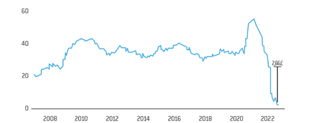
There is an impressive study by a large English retailer, Asda, which shows that disposable income after forced expenditure (housing, energy, food) has massively contracted, or even disappeared completely for nearly 60% of the population. This is shown in the “Nothing left” graph below.
Nothing left – Discretionary income of the second quintile of earners has fallen since the beginning of the year in the UK
Source :
Asda Income Tracker, Center for Economics and Business Research
Note: Discretionary income is the amount of money available in a household after subtracting taxes and essential expenses.
This shows the discretionary income of the second lowest quintile of the UK population typically average £35-40 per week. The peak of £50 income shown is the ‘free’ money distributed during Covid. In 6 months, recipients have gone from an average of £35/40 and a peak of £50 to £2.
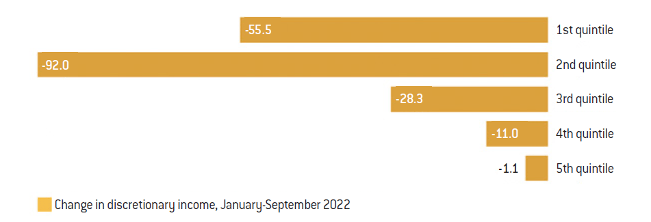
Lowest incomes – Inflation has disproportionately hit the purchasing power of the poorest families in the UK (in %)
Source :
Asda Income Tracker, Cebr
The graph above shows the distribution for all quintiles: the fifth is the most affluent, for which little has changed; the fourth has lost an average of -11% of purchasing power, which is still bearable; the third quintile has lost -28%; the second has lost almost everything, while the first quintile’s income has been halved. This represents the period between January and September 2022. The key point is that for the three lowest quintiles, i.e. 3/5 of the UK population, the impact is considerable. Thus, inflation affects different social classes differently. For example, a modest household will spend about 50% of their income on housing, 20% on energy and food, i.e. 70% on these three items of expenditure, whereas a wealthy household will spend only 30-40% of its income on these three items. This is why an inflation of 15% will affect the poor households more than the rich households. For this reason, it is dangerous to look at inflation in terms of overly averaged indices, as these do not sufficiently represent the different ways in which it affects various social classes. And we are only at the beginning. The cost of energy only started to rise after the summer. Interest rates have not yet peaked, most households have not yet had to renew their mortgages, people have not yet refinanced and have not yet needed to make new rentals and other related expenses. The same goes for food, prices will continue to rise. We are not yet at the point of the biggest pinch in purchasing power, and the effects on consumers are already great. Not to mention the asset side. When the bulk of a population’s savings residing in housing and real estate loses 20 or 30%, or when you hold a stock market portfolio of shares or cryptocurrencies and the prices collapse by 20, 30, or 40%, the destruction of wealth is added to the destruction of purchasing power. These effects are major and cannot be ignored.
What happened in the United Kingdom will happen elsewhere, perhaps with a slightly different time frame, with a different scope, but the fact remains that the automatic stabilisers will have the same problems as households: the cost of the debt will be higher for everyone. This phenomenon is happening in other economies. Interestingly, in the United States, it is not yet seen nor accepted, with the level of consumption of Americans still holding steady. That’s why some people think that they might be able to get out of it with a small, brief recession. But consumption has only held up for two reasons. The first is that a lot of money has been distributed that is not yet fully spent. Thousands of billions have been handed out in the form of cheques by the Trump administration. This has been implemented globally during the year 2022 to compensate for the loss of purchasing power. Moreover, like the British, Americans do not start by reducing their consumption when times get tougher, but instead take out more credit. This is how the American economy works.
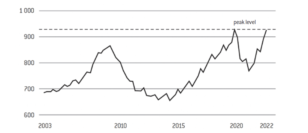
Outstanding credit cards are on the rise (in billions of dollars)
Source :
Federal Bank of New York
PRESS RELEASE N°: 2023/011/EFI, « Global Progress in Reducing Extreme Poverty Grinds to a Halt », World Bank, October 05th 2022.
Alex Hammer, « Nearly 40% of small businesses in the US failed to pay rent in October – with more than HALF saying their prices have been hiked at least 10% over the past six months », Daily Mail, November 1st 2022.
This chart from the Fed shows outstanding credit cards, which rapidly rose back to an all-time high in 2022. This illustrates that the savings and over-savings made during Covid are melting away; when there are no more, you start taking credit out to maintain your standard of living, and then sooner or later this pattern of taking on more debt has to stop.
Other indicators point in the same direction that are also harbingers of great depressions. For example, a World Bank’s study shows that we have had decades of progress in living conditions globally. However, in 2022, this progress has stopped7. This dramatic change of course does not bode well.
There are some warnings that need to be considered. For example, almost 40% of small businesses in the US reported that they could no longer afford to pay their rent.8 This proportion may seem implausible, but it is a current reality in the United States, where everything had been done to soften the circumstances through monetary tools and credit.
There is also a growing inability of households to pay their energy bills. In the UK, the situation is striking, but it is also starting to be striking in France and the rest of Europe. Moreover, food banks say they have never seen so many applicants, especially from the working population. Admittedly, all the signs are there. We cannot say how long it will last and how much of an economic catastrophe it will be, but we already know it will be tough and it has already started.
A tsunami of need – Almost 1.3 million emergency food parcels have been distributed
in the UK
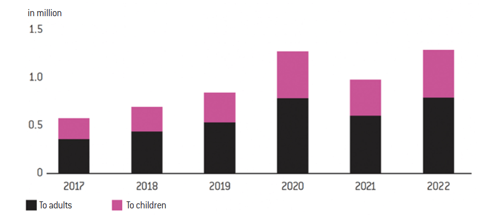
Source :
Trussel Trust
Note: The figures show, for each year, the number of parcels distributed across the UK between April and September.
Sharp contraction – The UK is experiencing the biggest fall in living standards on record
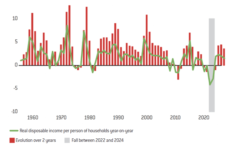
Source :
Office for Budget Responsibility
Note: Forecasts from 2022-2023
This graph shows living standards in the UK. There is now an unprecedented reduction in purchasing power (the projection period is hypothetical, but the shaded period is real, corresponding to the biggest contraction in purchasing power and living standards since this index was first measured).
It is therefore already well established that consumers are weakened. We can see this very clearly in the UK, we are starting to see it in other countries, even in the US. But rates are going to continue to rise globally and at an unprecedented rate in an economy that is at the peak of its debt, to levels that are going to be unsustainable when rates are at 5% or more.
With the worst of inflation not yet absorbed, the worst of the contraction in purchasing power is yet to come. Today, inflation is around 8-10%, depending on the area, and rates are between 4 and 5%. Therefore, the probability of the curves crossing is low. All this leads us to believe that we will have to go above 5% or even 6%, and that this famous “dot plot” continues to move as it did in the 1970s.
The contraction in house prices and the surge in borrowing rates in Sweden
Another way to see how far we have come into this period of probable depression is to look at the housing markets. Of course, there are latencies between different countries, as some borrow at fixed rates, others at variable rates, and over longer or shorter periods. For example, in France, people tend to get into debt over 15 or 20 years at fixed rates. When rates go up, borrowers are not immediately affected, because there is a huge stock of fixed-rate debt, affecting Banks but not necessarily them.
On the other hand, some countries have a large proportion of variable rates and borrowers are affected immediately. This is the case in Sweden, Canada and New Zealand. These countries are therefore warning signs of what is likely to happen in housing markets as a whole.
A rapid fall – Swedish house prices are in the worst slump since the early 1990s
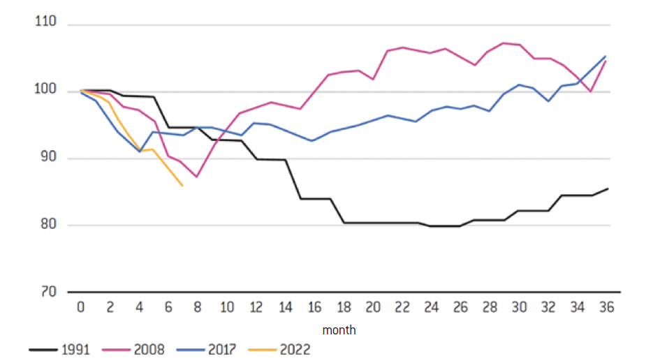
Source :
Statistics Sweden, Valueguard
The above chart illustrates house prices for Sweden which has a large proportion of variable rates and is therefore a much more reactive market than France or Germany. Each historical cycles are illustrated: the 1991 property cycle, the 2008 subprime curve, 2017 showing a small correction and finally 2022 (the yellow curve). It appears that the current rate of contraction in house prices is considerable: on a base of 100, after 8 months, we are already at -15%. This is the fastest slope we have ever seen. All these precursory signs show the extent of the current strong and rapid contraction. Another significant example is that of American households taking out a loan to buy a property. The below chart shows two curves: the 30-year mortgage rate and the Fed rate (light blue). We can see that this rise is brutal. We had gone down, on average, to around 3% and we are now up to 7% in less than a year. This curve, which follows that of the key rates, is very important as it directly conditions the property market.
Evolution of US household borrowing rates
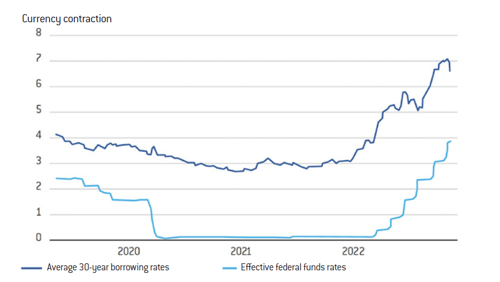
Source :
Freddie Mac, Federal Reserve
The average American household that goes from a 3% to a 7% borrowing rate is still earning about the same, and the amount of real estate has not changed dramatically. This will cause property prices to fall (as we are starting to see in Sweden), and/or it will cause a considerable contraction in purchasing power, particulary as the cost of borrowing doubles in 6 to 9 months, which will be unbearable for many.
When central banks raise rates, all other rates follow. This movement is indeed violent and unprecedented and is happening in all developed economies at the same time.
The housing bubble is bigger than ever – Inflation-adjusted house prices
Source :
Reventure Consulting (indice Case Shiller)
The « Minsky moment » is when speculation reaches an unsustainable level, leading to a rapid market collapse. This is the moment when investors’ expectations suddenly adjust, leading to asset fire sales, a general revaluation of risk and thus higher borrowing costs. In other words, this is the moment when financial bubbles burst. On the subject, see Caroline Brouillette, « Le « moment Minsky » de Chrystia Freeland », L’actualité, July 12th 2022.
This graph shows the extent of the phenomenon. The great surge in US property prices took place in a very short space of time. But even before that, the rise in 2006 was also a speculative bubble. We can see the extent to which cycles have corrected here post 2006/7. It is likely that we will have a similar or an even worse slope in 2022. This will have a huge impact on the economy, and not only on borrowers, but also on lenders, financial markets, etc. The recent collapses of banks such as SVP and Credit Suisse are a good example of how large and fast a bubble can burst when too much debt is taken on and rates rise sharply and continuously. Overall, it is likely that we are not in a simple economic slowdown but in a Minsky moment9.
CONCLUSION
There will come a time to say whether or not this monetary madness has caused the inflation we are beginning to experience. But it is imperative that we put an end to it. No one disputes this. And we must realise the severity of the situation and the risks of a great depression. A great depression in addition to all the factors of disintegration of our societies (regression of democratic models, loss of confidence) would be particularly dangerous. We must face the situation head on, be reactive and not simply observe a collapse of the economy. It is urgent to stop pouring out easy money, multiplying small cheques, cobbling together “shields”, etc. All of this is also inflationary, and we can no longer afford it. The governments have in fact had to revise their commitments downwards: the cost of their debt is rising again. This problematic development is unavoidable. It concerns all states, particularly as they are more indebted and more dependent on borrowing. Inflation is the worst economic scourge for everyone. To reduce it, we have only one tool: base rates, and we know what that will do. We need to acknowledge the current situation and its severity in order to act accordingly, and if possible radically. This will be the moment to rebuild our economic and democratic foundations because, as Churchill said, “never waste a crisis, it is always an opportunity to be reborn, to re-found, to rebuild”. This is undoubtedly an opportunity to say that the monetary tool should no longer be used as it has been up to now and to correct the inequalities in the creation of wealth and the evolution of purchasing power that have lasted too long in recent decades. The study of Asda’s quintiles is illuminating. The image that the very wealthy project to a population that can no longer meet its basic needs is socially destructive.
Moreover, a reflection on currencies should also be carried out. We are no longer in a system based on the dollar as the only international currency. There is an international solution to be found. No country can act alone, not even the United States. A rethinking of the Western model is necessary. We must prepare ourselves for the harshness of the coming crisis, protect the weakest and try to temper the social and political reaction, which will inevitably occur, to the detriment of the poorest. What is at stake is the acceleration of a disintegration process. As if the economy no longer allows economic and social progress from generation to generation, the Western democratic model will definitely be put at fault.


